COVID-19 UK Data Graphing
tags: Python
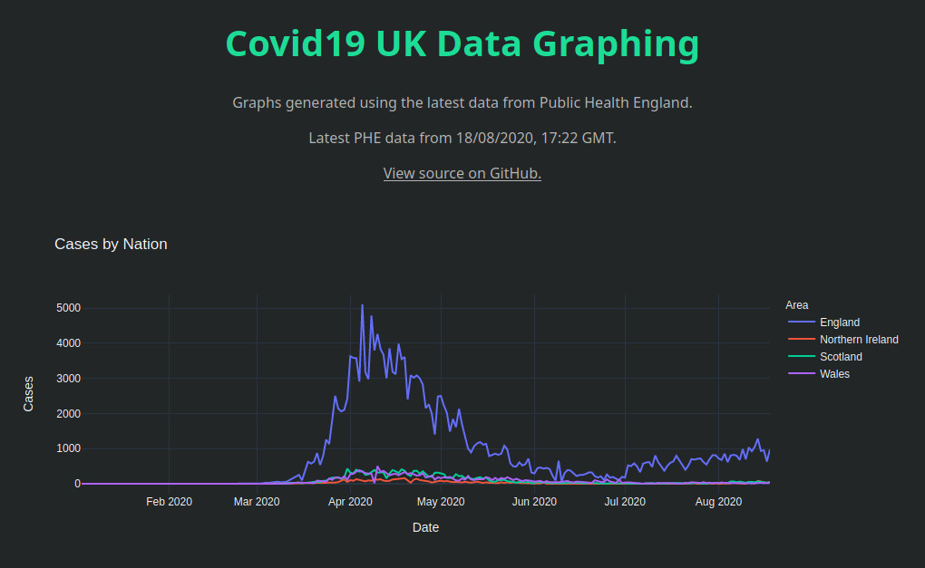
A website that provided easy-to-understand maps of cases of COVID-19, created before Public Health England added them on their site.
- Built using Python, Dash, Pandas, and Plotly.
- Data fetched from Public Health England’s Cov19API.
- Graphs of rolling averages and scatter maps of cases. created with Plotly.
- Hosted using Heroku.